


 Library card redesign
The intent behind the black box - clarity and distinction - is very good. I also agree that when properly sized, it looks nice. However, its implementation keeps causing problems.
I think those examples verged on individual mistake more than being a global problem.
For equipment, we have:
No bold text, no cost:
Agate Talisman
An Anarch Manifesto
Bloodstone
Inscription
Leather Jacket
Powder of Rigidity
Reliquary: Biague
Writ of Acceptance
No bold text, with cost:
Cooler
Flak Jacket
Incriminating Videotape
Kevlar Vest
Reliquary: Trinket
Vial of Elder Vitae
Vial of Garou Blood
Living Manse
Bold text, no cost
(numerous)
Bold text, cost
(numerous)
Living Manse is an interesting example, as it has a cost but also has no black box:

As for the cards without text, well there is always flavor text...
If we're putting flavor text back on the table - and we probably should - a lot of cards change.
Please Log in or Create an account to join the conversation.


In Ke's layout for equipment cards, bold is used only for "strike".
What I wanted to say earlier is that we must not mistake one-time error and flaws in the layout.
As for flavor text, it should not change the card. Let's first define a clear code of how library cards should be. Then, when everything is done, we can can return to cards that are/look empty and fill them with flavor text.
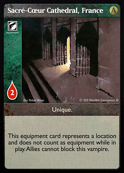
EDIT : on a totally different matter, please forgive my patriotism but could we take advantage of the opportunity provided by this redesign to finally correct a typo ? The proper name for this card should be "Sacré-Cœur Cathedral, France". B)
Please Log in or Create an account to join the conversation.
I'm not sure to get your point.
In Ke's layout for equipment cards, bold is used only for "strike".
What I mean is "text that would normally be bold in the official layout but goes in the black box in the proposed layout". So, things like the stat line for allies, "Unique", "Electronic", "Location", "Haven", "Animal", etc.
What I wanted to say earlier is that we must not mistake one-time error and flaws in the layout.
The same thing keeps coming up with the black text box: a box is empty because there's no text for it, so something is contrived to fill it. If the black text box didn't exist and standard bolding rules were used, there wouldn't be this invented need. And again, it's not that I think it's trying to do something bad. It's trying to do something good - increase clarity and distinction. However, cleaning up the bolding rules would also accomplish the goal of clarity and distinction, and without contriving things to put in text boxes.
The examples of Loyal Street Gang and The Knights are the most egregious. They take text that would go into the black text box and instead put it into the white text box. Then instead of having no black text box at all, one is created and filled with redundant text only because that text box would otherwise be empty. I don't think there are other allies that would have this exact problem, but this problem doesn't have to exist at all.
With equipment cards, there's a lack of consistency of whether there is a black text box and what goes inside it if there is one. In some circumstances, a black box is created only for the purpose of filling it with redundant text.
As for flavor text, it should not change the card. Let's first define a clear code of how library cards should be. Then, when everything is done, we can can return to cards that are/look empty and fill them with flavor text.
By "change the card", I mean the flavor text would result in size adjustments in the text boxes. And yes, I agree that we should have a clear code of what library cards should look like.
")
Please Log in or Create an account to join the conversation.
In my opinion they are just error waiting to be corrected. (No more relevant than Polaris Coach where "Haven" has been forgotten from the black box.)
And if they were made that way knowingly, then we should just agree on keeping empty white box for flavor text.
As for the bold text versus separate boxes, I think that the rules for the distinction will be the same in both case. But by having separate boxes, we could also use bold text in order to gain more clarity. Like it was done on weapon for Strike (even though that might be a bad example).
So yes, that's a little more "work". But the result might be worth it.
Please Log in or Create an account to join the conversation.
I am not in Ke's head but I don't think The Knights should be an examples of the lack of consistency.
In my opinion they are just error waiting to be corrected. (No more relevant than Polaris Coach where "Haven" has been forgotten from the black box.)
And if they were made that way knowingly, then we should just agree on keeping empty white box for flavor text.
Or have a single, white, not-ever-empty text box and use bold text for the things that need it. And also have flavor text because flavor text is cool. The black text box is a solution looking for a problem that doesn't exist.
Please Log in or Create an account to join the conversation.
EDIT : on a totally different matter, please forgive my patriotism but could we take advantage of the opportunity provided by this redesign to finally correct a typo ? The proper name for this card should be "Sacré-Cœur Cathedral, France". B)
That would be up to our (*ahem* very French) Rules Team.
") While the official rules and text of cards are in American English, I'm strongly in favor of adhering to spelling proper names in their native tongues. Well, provided the native tongues use Latin characters.
While the official rules and text of cards are in American English, I'm strongly in favor of adhering to spelling proper names in their native tongues. Well, provided the native tongues use Latin characters.When designing new cards, the Design Team has requested and welcomed such spelling corrections from our playtesters. We also do our best to determine the correct spelling when we initially design the cards, including reaching out to native speakers.
Please Log in or Create an account to join the conversation.
- You are here:
-
Home

-
Forum
-
V:TES Discussion
-
Generic V:TES Discussion
- Library card redesign