- Forum
- V:TES Discussion
- Generic V:TES Discussion
- So, I've been at it again... [Yet another background and layout thread]
 So, I've been at it again... [Yet another background and layout thread]
28 Oct 2019 14:03 #97598
by Ankha
Replied by Ankha on topic So, I've been at it again... [Yet another background and layout thread]
They straddle the sidebar and the cardtext. And they are not aligned with each other.
What do you mean by "something wrong" ?There's something wrong with the disciplines on Scalpel Tongue,.
The following user(s) said Thank You: LivesByProxy
Please Log in or Create an account to join the conversation.
28 Oct 2019 15:27 #97599
by LivesByProxy


 Gangrel. Noddist. Camarilla. Once each turn, LivesByProxy may burn 1 blood to lose Protean
  until the end of the turn and gain your choice of superior Auspex
  , Obfuscate
  , or Potence
  for the current action.
Replied by LivesByProxy on topic So, I've been at it again... [Yet another background and layout thread]
Regarding the sidebar: it looks like you're using a gradient mask to have the sidebar fade away into the artwork. IMO, you should stretch out the gradient to have sidebar fade gradually and not just fall off so sharply.
I also think the text-boxes should be the same uniform size, and font-size adjusted accordingly.
I would also recommend clan symbols be in the upper left corner preceding the vampires name.
I would also, also like to see the blood cost symbol have similar lighting and shading as the capacity cost does, rather than the flat red icon it is now. Not sure how this would look in practice.
Just my thoughts, I may contribute something here of my own soon.
The following user(s) said Thank You: Lech
Please Log in or Create an account to join the conversation.
- LivesByProxy
-

- Offline
- Antediluvian
-

- Malfeasant Entity
Less
More
- Posts: 518
- Thank you received: 76
29 Oct 2019 08:52 #97608
by Lönkka
The Crypt cards look very much eye candy.
But especially the Library cards look somehow odd. Perhaps the side bar should be wider and the symbols larger?
And text definitely should be larger!
I've been reorganizing my collection and been loving the new font size introduced in Lords of the Night! Coupled with the clearer background it makes reading of the cards much easier a job. <3 <3 <3
All in all, the cards look extremely nice, but I feel that somehow the vampire feel to it has been lost (probably partly, but not fully, due to the choice of illustrations).
Replied by Lönkka on topic So, I've been at it again... [Yet another background and layout thread]
It takes me a little bit more time than I think but the result is under here.
The Crypt cards look very much eye candy.
But especially the Library cards look somehow odd. Perhaps the side bar should be wider and the symbols larger?
And text definitely should be larger!
I've been reorganizing my collection and been loving the new font size introduced in Lords of the Night! Coupled with the clearer background it makes reading of the cards much easier a job. <3 <3 <3
All in all, the cards look extremely nice, but I feel that somehow the vampire feel to it has been lost (probably partly, but not fully, due to the choice of illustrations).
Finnish  Politics!
Please Log in or Create an account to join the conversation.
01 Nov 2019 12:37 #97649
by Stéphane81
Replied by Stéphane81 on topic So, I've been at it again... [Yet another background and layout thread]
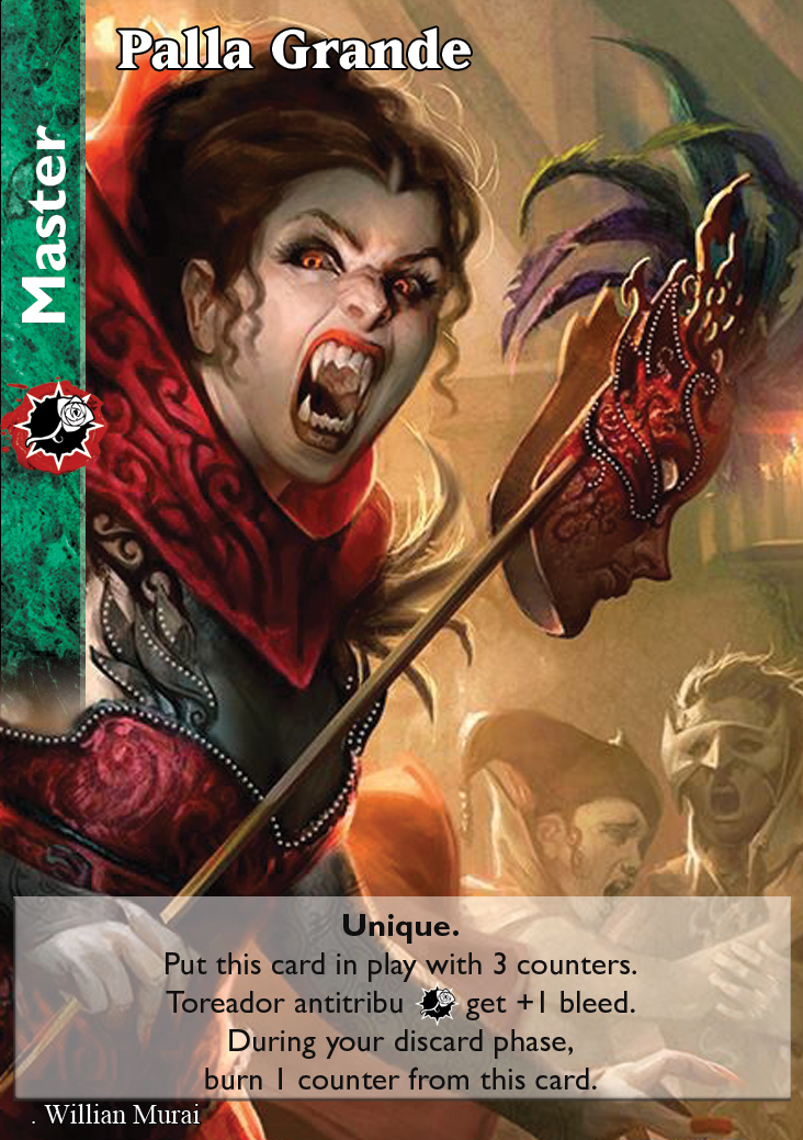
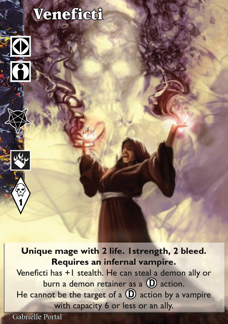
So, I had made my homeworks on this topic
.
The disciples are place regarding the center of the symbol. I do not like the position on actual cards. The designer just keep the space between each discipline and that give a flat feeling about the basic ones . The advenced symbol is also set on this line.
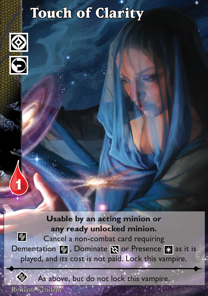
I like varied text box and keep the font size. I do agree that the style is important but the first fonction of a card is its text. And I do have difficulties in reading some cards like the Jessica ADV or Touch of Clarity . (And yes, I'm wearing glasses to read ^^)
Concerning the fade away, a more gradually mask give a mess of pixels effect with some art. So I keep it short.
.
A larger text box is a good idea so the sidebar goes on top and gives more space to the text. I also change the separator. I have to admit that the cross wasn't a great idea. Fortunately, Vampire is also a rpg and the character's sheet provide me the perfect one (I think).
The required disciplines are no longer in the sidebar but are kept in the same vertical space that the other signs. The center of the under symbol is align with the left corner of the upper one. I know it's odd but in this way, the symbol is big enougth to be "read".
I keep the bolt font to write the conditions text. The blood drop habe been remake as was the blood capacity seal.
.
CRYPT
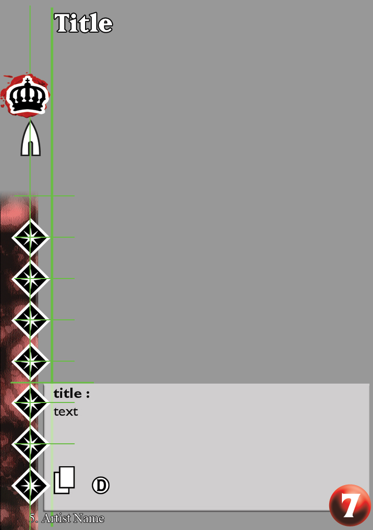
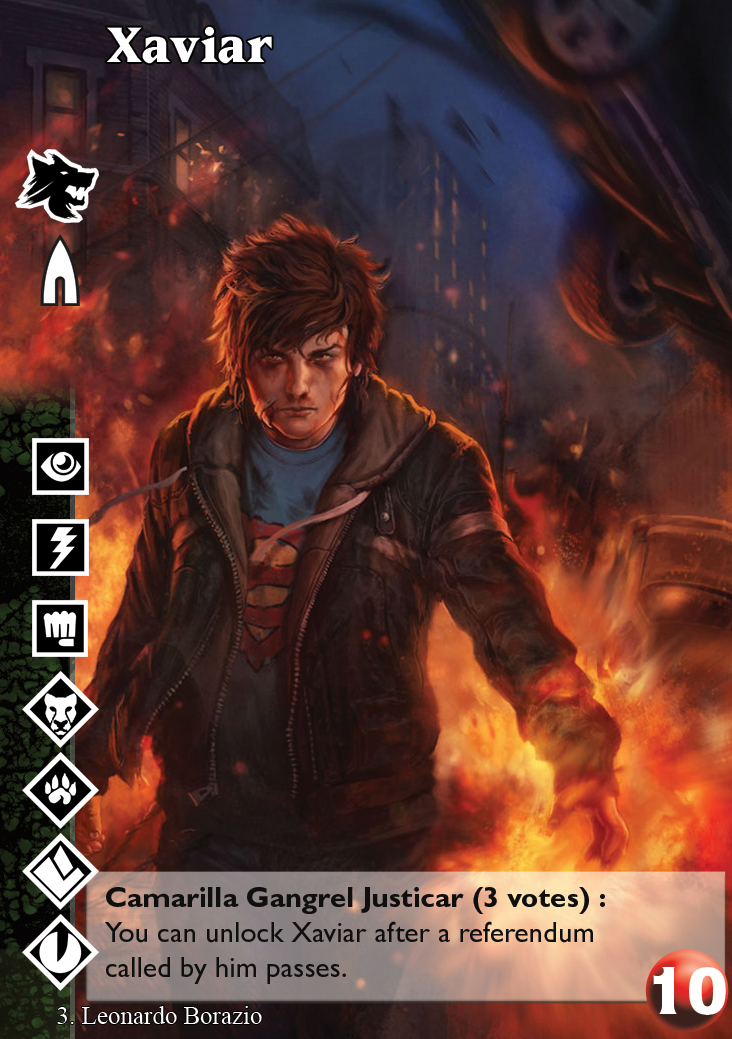
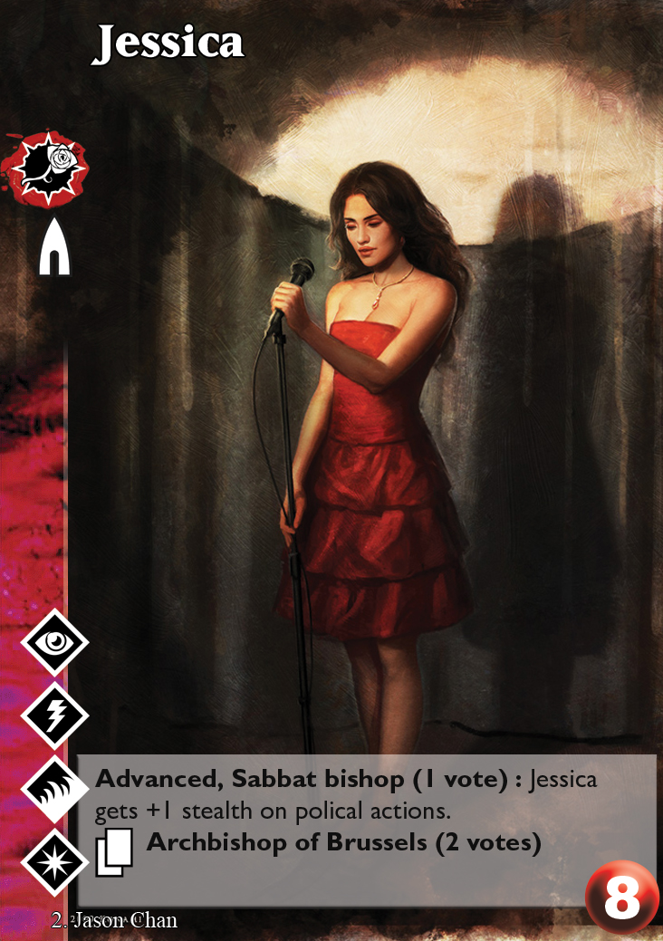
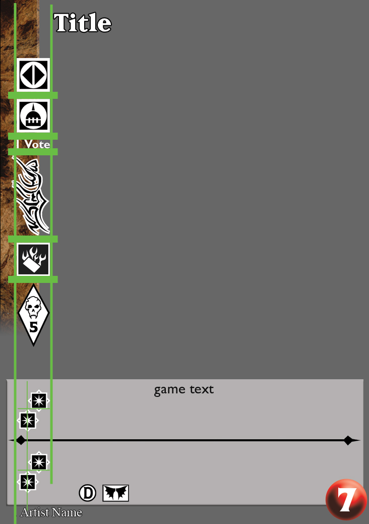
I'm using guide lines to align elements with each other. The sabbat blood stain is the larger clan mark. Then it is the one I used as a reference. As you can see, the title is set on the other side of the line and the upper-left corner can "breathe" with some space.The disciples are place regarding the center of the symbol. I do not like the position on actual cards. The designer just keep the space between each discipline and that give a flat feeling about the basic ones . The advenced symbol is also set on this line.
I like varied text box and keep the font size. I do agree that the style is important but the first fonction of a card is its text. And I do have difficulties in reading some cards like the Jessica ADV or Touch of Clarity . (And yes, I'm wearing glasses to read ^^)
Concerning the fade away, a more gradually mask give a mess of pixels effect with some art. So I keep it short.
.
LIBRARY
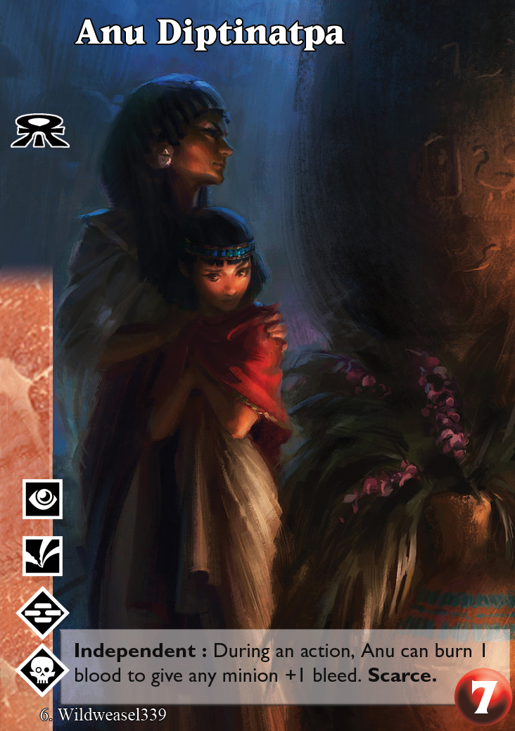
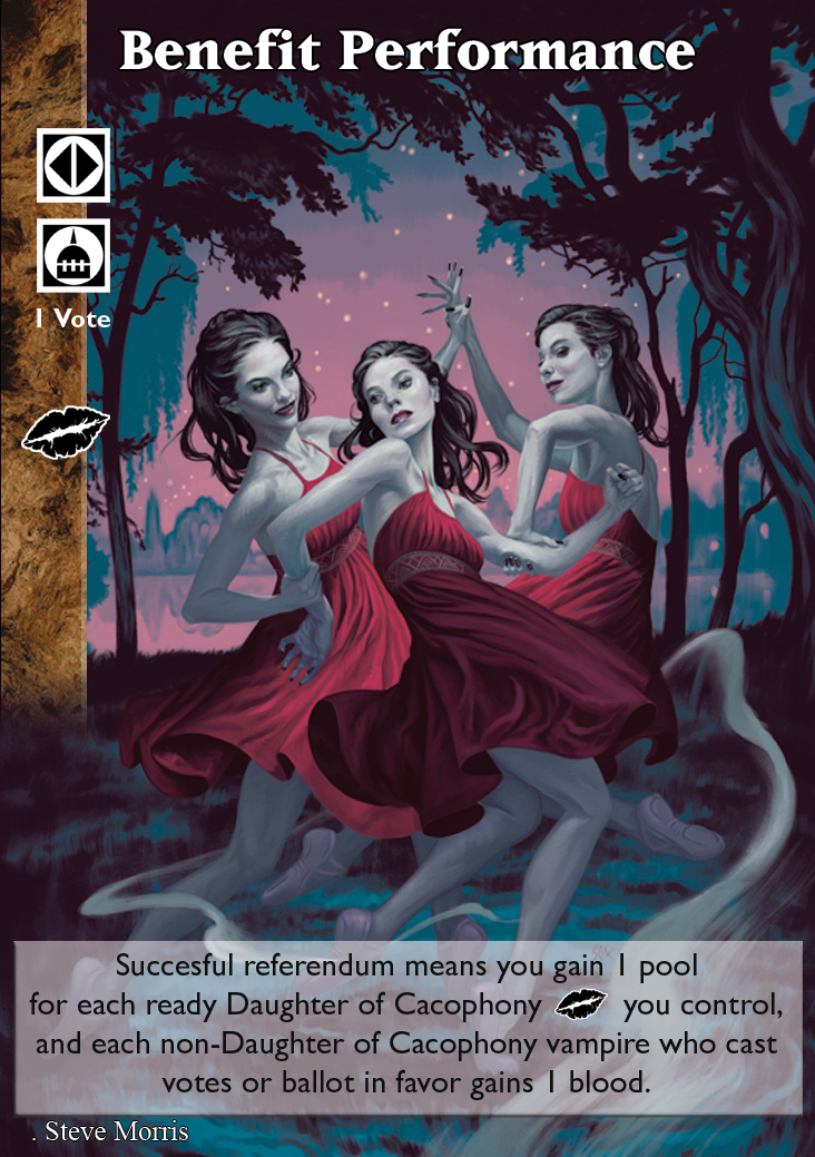
As before, I used the Sabbat stain to place the main guide line. We've got a lot of elements with different forms on this sidebar. They're all align with the main line and the same in-between space. They never are all on at the same time so the result is not too heavy.A larger text box is a good idea so the sidebar goes on top and gives more space to the text. I also change the separator. I have to admit that the cross wasn't a great idea. Fortunately, Vampire is also a rpg and the character's sheet provide me the perfect one (I think).
The required disciplines are no longer in the sidebar but are kept in the same vertical space that the other signs. The center of the under symbol is align with the left corner of the upper one. I know it's odd but in this way, the symbol is big enougth to be "read".
I keep the bolt font to write the conditions text. The blood drop habe been remake as was the blood capacity seal.
The following user(s) said Thank You: Charles_Bronson, Lech
Please Log in or Create an account to join the conversation.
- Stéphane81
-

- Offline
- Neonate
-

Less
More
- Posts: 26
- Thank you received: 12
01 Nov 2019 13:53 #97650
by LivesByProxy


 Gangrel. Noddist. Camarilla. Once each turn, LivesByProxy may burn 1 blood to lose Protean
  until the end of the turn and gain your choice of superior Auspex
  , Obfuscate
  , or Potence
  for the current action.
Replied by LivesByProxy on topic So, I've been at it again... [Yet another background and layout thread]
What is your goal with this?
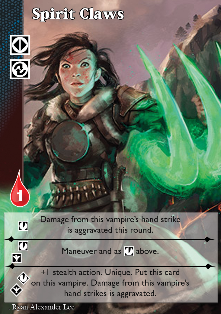
The staggered discipline "cost" in Spirit Claws looks bad IMO.
I've never been a fan of the side-bar, even though it makes VTES identifiable as VTES... nor am I a fan of the really weird abstract "skins" for different card types: Master cards are the green marble of the VTM rpg book, and combat cards get a red "skin" OK, but what about the rest of them? Why are action modifiers a mosaic? Why are allies this abstract purple, yellow mess? Reaction cards are an abstract white-black something?
The old political cards used to look like parchment with a red wax seal, and the newer design kind of tries to hint at that, but it's just kinda "meh."
Please Log in or Create an account to join the conversation.
- LivesByProxy
-

- Offline
- Antediluvian
-

- Malfeasant Entity
Less
More
- Posts: 518
- Thank you received: 76
02 Nov 2019 13:25 #97654
by cmdrKEEN
Replied by cmdrKEEN on topic So, I've been at it again... [Yet another background and layout thread]
I am a big fan of the sidebar. It is that part of the cards, thats visible when you fan them out on your hand, so you can easily see what you can play.
In all those new designs, I am missing the flair of playing an ancient vampire. I dont mind a solid frame if it gives the cards the mood of the rpg. The world in the rpg is described as a gothic punk version of our world. On the old Jyhad cards the textbox and frames had sometimes something of a stone table. While the design of those had its flaws, i liked the theme and feeling they were trying to transport.
The crosses in the textbox already helped in that. Maybe some elements from gothic architecture either in stylized form or as border would also help giving those cards a less Sci-Fi-ish look. As would any stone or weared down materials.
On a completely different note, these cards seem so flat. Maybe add some shadows to the elements that overlap others to lift them from the layer under it?
Please Log in or Create an account to join the conversation.
- Forum
- V:TES Discussion
- Generic V:TES Discussion
- So, I've been at it again... [Yet another background and layout thread]
Time to create page: 0.077 seconds
- You are here:
-
Home

-
Forum

-
V:TES Discussion

-
Generic V:TES Discussion

- So, I've been at it again... [Yet another background and layout thread]


