


 Library card redesign
24 Sep 2016 07:46 - 24 Sep 2016 07:47 #78525
by Lönkka
I like the one with black box much more. Having the stats separate makes it more clear.
One thing I don't like in the new cards is the positioning of the text to the left side. Centering looks so much better (and i think it is the way it has been done for quite some time now in VTES).
Replied by Lönkka on topic Library card redesign
And when it's an Ally it has the Ally type and stats — this was based on a lot of feedback I and think it works really well in this scenario (even if not a prerequisite, it's important information). Initially I wasn't convinced about ally stats being placed there — but I was won over with good reason:

I like the one with black box much more. Having the stats separate makes it more clear.
One thing I don't like in the new cards is the positioning of the text to the left side. Centering looks so much better (and i think it is the way it has been done for quite some time now in VTES).
Finnish  Politics!
Politics!
Last edit: 24 Sep 2016 07:47 by Lönkka.
Please Log in or Create an account to join the conversation.
24 Sep 2016 12:45 #78526
by Ankha
Replied by Ankha on topic Library card redesign
There is a bias. I'd like to see the same comparison with the bold part on one line for the left version. I think it would even look better since the text size would be larger.
And when it's an Ally it has the Ally type and stats — this was based on a lot of feedback I and think it works really well in this scenario (even if not a prerequisite, it's important information). Initially I wasn't convinced about ally stats being placed there — but I was won over with good reason:
I like the one with black box much more. Having the stats separate makes it more clear.
One thing I don't like in the new cards is the positioning of the text to the left side. Centering looks so much better (and i think it is the way it has been done for quite some time now in VTES).
Prince of Paris, France
 Ratings Coordinator, Rules Director
Please Log in or Create an account to join the conversation.
26 Sep 2016 10:26 - 26 Sep 2016 13:44 #78530
by 666Raziel
Replied by 666Raziel on topic Library card redesign
Ok, here are some thoughts gathered during the week-end.
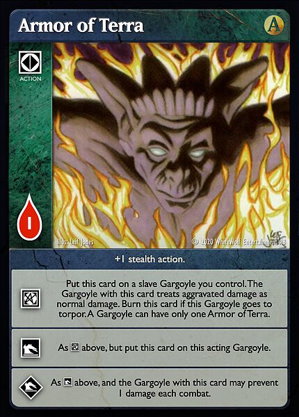
1) It seems that the discipline icon is not always shown in "As above..." sentences. For example, in Armor of Terra , we can see it for the effect but not for the
  . In
Bauble
, there is no icon either.
. In
Bauble
, there is no icon either.
I don't know if this was done intentionally or not, but it shouldn't be this way. Like sect and title in crypt cards that are always bold (or not), we should either always put the icon or never.
Personally, I think that we should always show the icon. It might become useful when we get bloodlines cards with different effects that are both based on the outferior level.
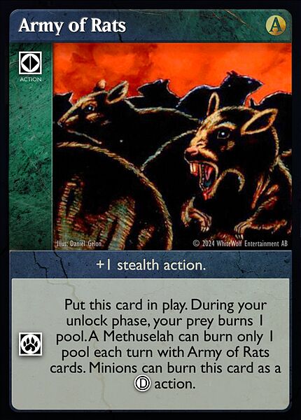
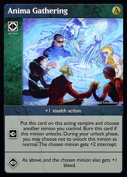
2) Having "+1 stealth action" in black box feels wrong because it creates many incoherence. Even if they don't require the same "element", there should be no difference between 419 Operation and Army of Rats layout.
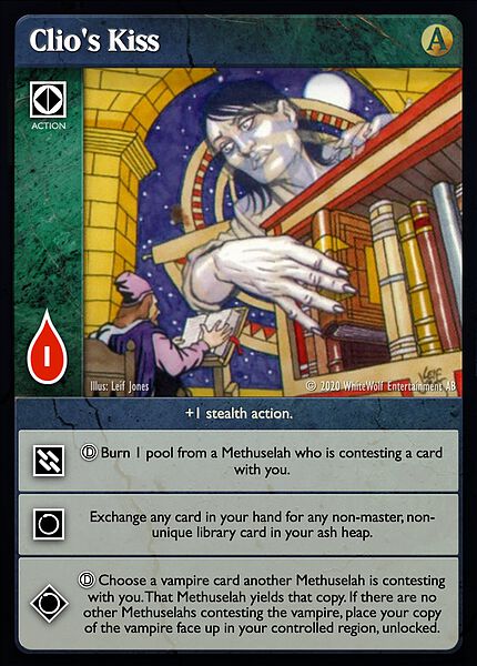
So I think that "+X stealth" should always be in the white box. This will free some space for cards like Armor of Terra or Anima Gathering . And I'm pretty sure it will be the same with cards that have 3 different action (like Clio's Kiss ).
Overall, I think black box should be only used for things that concerns every cards regardless of their type.
For me it would be :
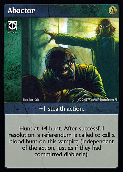
This might have some unexpected (but good) effect. Like for Abactor that should have a blackbox for "Hunt." and only +1 stealth action in its white box.
3) Now that cardtype are fully written I think that we should find a solution to make them visible without using bold text. This is particularly noticeable in Abombwe's cards where, at first sight, we see no distinction between cardtype and playability restriction. Have you try underlined text ? Or perhaps bold + underline ?
4) Now comes the part where BenPeal will jubilate.
If we want to have a thorough layout, we are going to have trouble with the black box when cards have different effects with specific restriction to each. That said, I'm not giving up !
(Mostly because the current pattern is worse when it comes to consistency.)
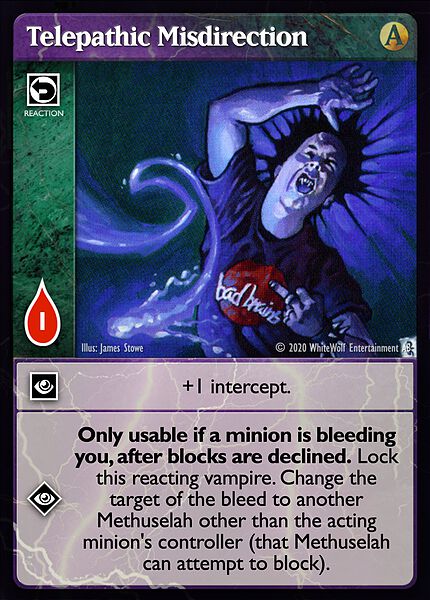
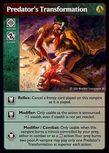
Have you try to add blackbox dedicated only to one level of discipline ? I think there are many cases (like Telepathic Misdirection ) where it can even save some space. Because we would occupy the space above the discipline icon. But i don't know if it's a good solution because there will also be the opposite. ( Predator's Transformation for instance.)
EDIT : come to think of it, there would also be a problem for cards (like Hall of Hades' Court) that have global restriction and then specific restriction for each level.
5) There is something wrong with Bestow Vigor and Black Hand Ritual. (I wanted to use the comment button, but I got an error message so here I am.)
EDIT 2 : BTW, Hall of Hades' Court is wrong too. The blackbox contains few information that are only applicable in the effect.
1) It seems that the discipline icon is not always shown in "As above..." sentences. For example, in Armor of Terra , we can see it for the
effect but not for the . In
Bauble
, there is no icon either.I don't know if this was done intentionally or not, but it shouldn't be this way. Like sect and title in crypt cards that are always bold (or not), we should either always put the icon or never.
Personally, I think that we should always show the icon. It might become useful when we get bloodlines cards with different effects that are both based on the outferior level.
2) Having "+1 stealth action" in black box feels wrong because it creates many incoherence. Even if they don't require the same "element", there should be no difference between 419 Operation and Army of Rats layout.
So I think that "+X stealth" should always be in the white box. This will free some space for cards like Armor of Terra or Anima Gathering . And I'm pretty sure it will be the same with cards that have 3 different action (like Clio's Kiss ).
Overall, I think black box should be only used for things that concerns every cards regardless of their type.
For me it would be :
- Non clan requirement
- Playability restriction ("Only usable when/if..." ; "Do not replace until...")
- Traits
This might have some unexpected (but good) effect. Like for Abactor that should have a blackbox for "Hunt." and only +1 stealth action in its white box.
3) Now that cardtype are fully written I think that we should find a solution to make them visible without using bold text. This is particularly noticeable in Abombwe's cards where, at first sight, we see no distinction between cardtype and playability restriction. Have you try underlined text ? Or perhaps bold + underline ?
4) Now comes the part where BenPeal will jubilate.
If we want to have a thorough layout, we are going to have trouble with the black box when cards have different effects with specific restriction to each. That said, I'm not giving up !
(Mostly because the current pattern is worse when it comes to consistency.)
Have you try to add blackbox dedicated only to one level of discipline ? I think there are many cases (like Telepathic Misdirection ) where it can even save some space. Because we would occupy the space above the discipline icon. But i don't know if it's a good solution because there will also be the opposite. ( Predator's Transformation for instance.)
EDIT : come to think of it, there would also be a problem for cards (like Hall of Hades' Court) that have global restriction and then specific restriction for each level.
5) There is something wrong with Bestow Vigor and Black Hand Ritual. (I wanted to use the comment button, but I got an error message so here I am.)
EDIT 2 : BTW, Hall of Hades' Court is wrong too. The blackbox contains few information that are only applicable in the
effect.
Last edit: 26 Sep 2016 13:44 by 666Raziel.
Please Log in or Create an account to join the conversation.
26 Sep 2016 11:50 #78531
by Ankha
Armor of Terra
+1 stealth action.
[tha] Put this card on a slave Gargoyle you control. This Gargoyle treats aggravated damage as normal damage. Burn this card if this Gargoyle goes to torpor. A Gargoyle can have only one Armor of Terra.
[vis] As [tha] above, but put this card on this acting Gargoyle.
[VIS] As [vis] above, and this Gargoyle can prevent 1 damage each combat.
As for Bauble, since there's only one inferior level, there's no need to indicate to which level we refer to.
+1 stealth action.
[vic] Put this card on the acting vampire. Search your library for a non-unique, non-location equipment card and put it on another minion you control, ignoring requirements and cost. This vampire cannot take actions, block or cast votes or ballots. You can burn this card and the chosen equipment during your untap phase or when the minion with the chosen equipment leaves the controlled region.
[VIC] As above, but you can burn this card and the chosen equipment at any time.
Replied by Ankha on topic Library card redesign
The CSV file does contain the discipline icons.1) It seems that the discipline icon is not always shown in "As above..." sentences. For example, in Armor of Terra , we can see it for the
I don't know if this was done intentionally or not, but it shouldn't be this way.
Armor of Terra
+1 stealth action.
[tha] Put this card on a slave Gargoyle you control. This Gargoyle treats aggravated damage as normal damage. Burn this card if this Gargoyle goes to torpor. A Gargoyle can have only one Armor of Terra.
[vis] As [tha] above, but put this card on this acting Gargoyle.
[VIS] As [vis] above, and this Gargoyle can prevent 1 damage each combat.
As for Bauble, since there's only one inferior level, there's no need to indicate to which level we refer to.
+1 stealth action.
[vic] Put this card on the acting vampire. Search your library for a non-unique, non-location equipment card and put it on another minion you control, ignoring requirements and cost. This vampire cannot take actions, block or cast votes or ballots. You can burn this card and the chosen equipment during your untap phase or when the minion with the chosen equipment leaves the controlled region.
[VIC] As above, but you can burn this card and the chosen equipment at any time.
Prince of Paris, France
Ratings Coordinator, Rules Director
Please Log in or Create an account to join the conversation.
26 Sep 2016 11:55 #78532
by 666Raziel
In that case, Armor of Terra [vis] level does not need icon because there is only 1 inferior level.
Replied by 666Raziel on topic Library card redesign
As for Bauble, since there's only one inferior level, there's no need to indicate to which level we refer to.
In that case, Armor of Terra [vis] level does not need icon because there is only 1 inferior level.
Please Log in or Create an account to join the conversation.
29 Sep 2016 02:47 - 29 Sep 2016 02:48 #78543
by Ke.
Yes, it's now consistent with other requirement icons. It's much simpler to say to new players "Match the icons in the white box to your vampire/s to use that effect".
Also, there isn't the space for it in the side bar or upper left (where it resides on vampires) — more so for dual clan cards. I quickly tested this and it was just plain weird.
It's aligned and positioned in the same manner as the blood cost icon — which is to align with the left most part of the box. There will not always be a clan or discipline icons to align to, so aligning with these makes no sense as it would lead to inconsistency across different cards. It's current alignment also minimises the impact on the Artwork.
Thanks fixed.
Yes, just haven't accounted for it — it's obviously a thing. Out of curiosity, why?
Replied by Ke. on topic Library card redesign
You expand the text box into the side bar, but the space you gain is spent almost entirely on displaying the requirement icon.
Yes, it's now consistent with other requirement icons. It's much simpler to say to new players "Match the icons in the white box to your vampire/s to use that effect".
Also, there isn't the space for it in the side bar or upper left (where it resides on vampires) — more so for dual clan cards. I quickly tested this and it was just plain weird.
- "Master", the pool icon, and the requirement icon are not properly aligned.
It's aligned and positioned in the same manner as the blood cost icon — which is to align with the left most part of the box. There will not always be a clan or discipline icons to align to, so aligning with these makes no sense as it would lead to inconsistency across different cards. It's current alignment also minimises the impact on the Artwork.
The Salubri icon is displayed instead of Salubri antitribu.
Thanks fixed.
Also, "antitribu" is not italicized, though I suspect that's because you're working from the .csv and haven't added automatic italicization logic to your text processing yet.
Yes, just haven't accounted for it — it's obviously a thing. Out of curiosity, why?
Last edit: 29 Sep 2016 02:48 by Ke..
Please Log in or Create an account to join the conversation.

Time to create page: 0.084 seconds
- You are here:
-
Home

-
Forum
-
V:TES Discussion
-
Generic V:TES Discussion
- Library card redesign